How I Developed the Logo for the Trading House ‘Madagascar’
This story began in a rather unconventional way. One day, a group of people gathered in Madagascar and decided to supply uniquely eco-friendly products to Eastern Europe. To ensure the project’s success, it was necessary to carefully package the newborn company with a distinctive corporate identity. Here’s how the logo and corporate identity for the trading house were developed.
Starting from scratch carries significant responsibility towards the client. One must think several years ahead and understand how the company will evolve along with its corporate identity, taking into account customer expectations and how the visual elements will integrate with the existing competitor landscape.
Having been to Madagascar before, I had a clear sense of what needed to be done. Madagascar, as the locals often say, is not Africa. Therefore, typical African themes would not be suitable here.
Three of the most recognizable symbols of Madagascar are:
- The chameleon
- The baobab
- The lemur
The idea of using a chameleon in the logo didn’t resonate with me right away. Chameleons are too specific and, quite literally, cold, even though they appear amusing in nature.
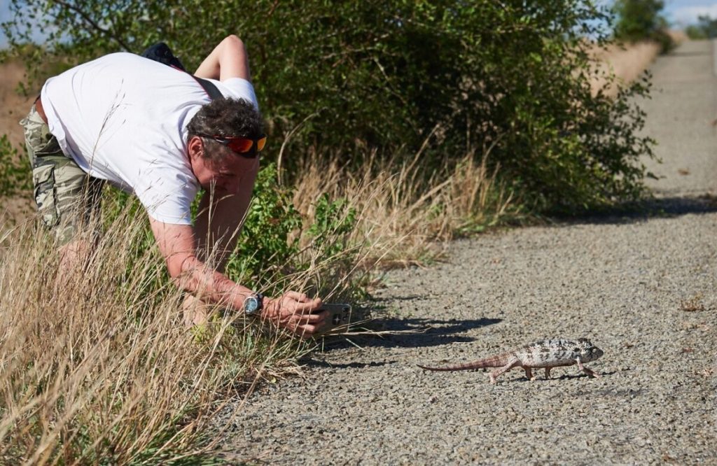
My encounter with a chameleon again.
The baobab, while iconic, seemed dull and not particularly elegant. However, as a symbol of Madagascar, the baobab is undeniably one of the most recognizable.

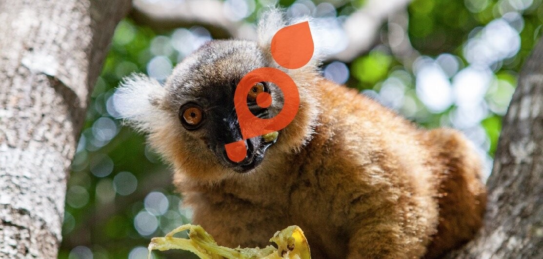
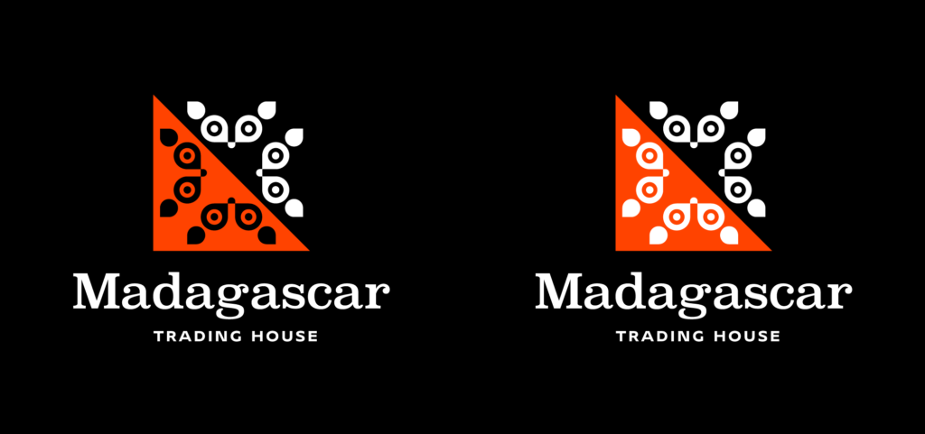
This left me with lemurs. Lemurs made a strong impression on me, so I decided to focus on their imagery when developing the logo. They are fluffy, with big eyes, cheerful, and endearing.
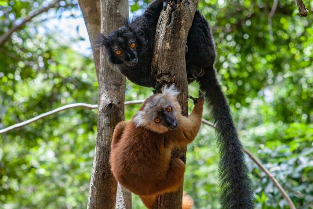
I began by studying a photo of a lemur. I quickly realized that the most important features are the eyes, ears, and nose. Therefore, I emphasized these elements in the design.

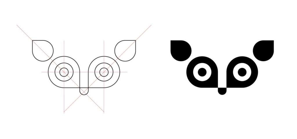
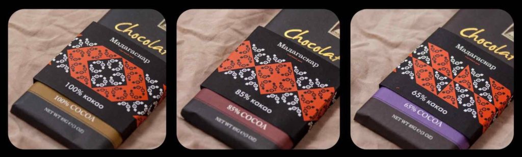
The idea to incorporate multiple lemur images into the logo and link them into a pattern was inspired by a technique used by Malagasy women. To protect their skin from excessive sun exposure, they apply various patterns to their faces.
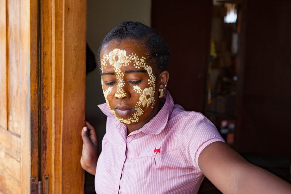
Those who can afford it use cosmetics, while those in villages use regular clay. The facial patterns range from simple coverings to intricate artistic designs.
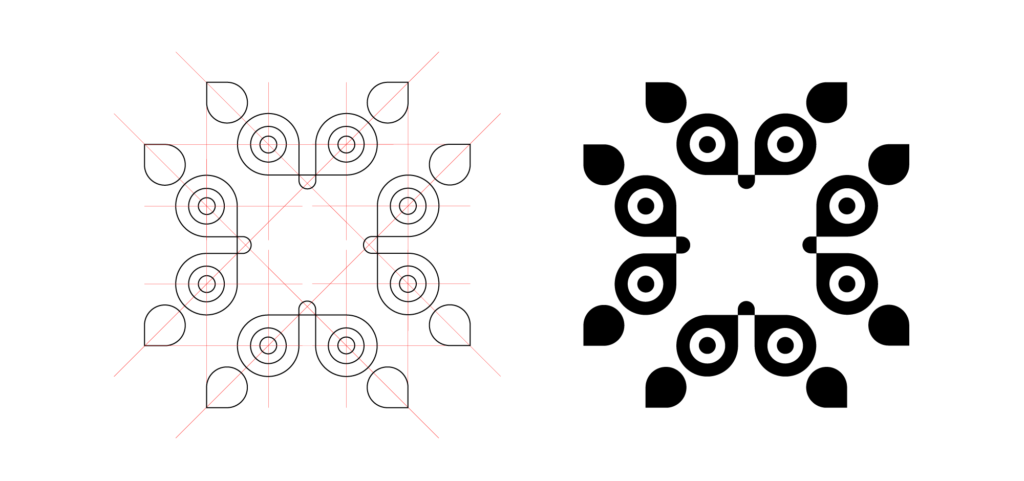
After reviewing the photos, I concluded that the main logo should feature not just one, but four lemurs.
This also adds an extra layer of meaning – representing the four cardinal directions, a compass, and a theme of exploration.
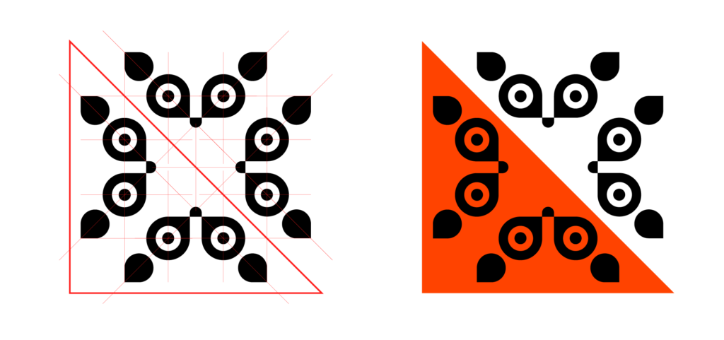
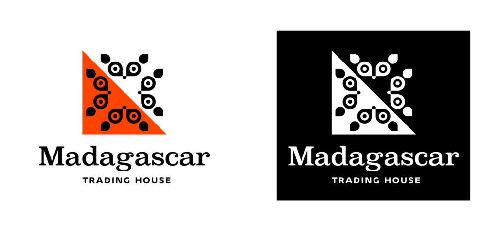
Once the main theme of the logo was established, refining the style became much easier. We developed the textual elements and brought together the corporate identity block.
I worked under tight deadlines, so I was simultaneously assembling the corporate identity and the company’s website.
I will discuss this further in my next article.
Art director Evgeny Golovach.