
Apexwel
Alpinism and Extreme Mountain Expeditions
Naming, logo and visual identity for an international alpine community.

ApexWel. An international community of alpinists and extreme travelers. The project brings together people who operate under high physical stress, at altitude, and in challenging weather conditions during mountain ascents.
Task.
To develop an international name suitable for registration and scalable growth of the community.
To create a mark, logo, and visual identity with strong contrast and clear readability across all applications — from digital environments to equipment and mountain use.
To embed a clear idea of route, ascent, and movement within extreme conditions into the visual system.


Solution.
Following an extensive naming exploration and validation process, we selected a combination of two words: Apex and Well.
Apex represents the summit — the highest point of the route and the ultimate goal of ascent.
Well refers to stability, resilience, and an internal state of readiness required to operate under pressure.
Together, the name forms the image of a person moving towards the summit with control, strength, and balance. Visually, the system is built on a strict and minimal structure.
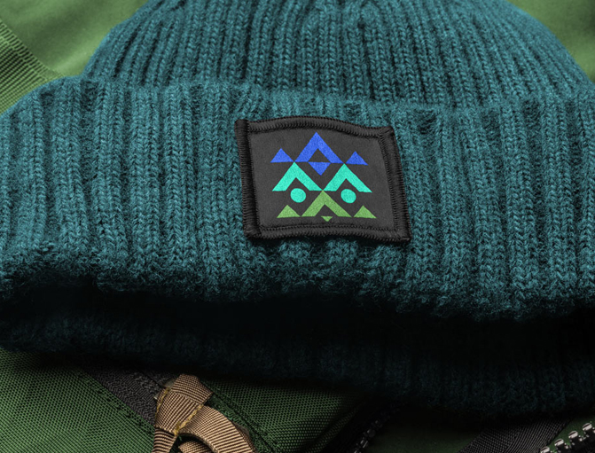
The symbol is based on mountain geometry and route lines. Repeating linear elements create a clear sense of upward and downward movement, reflecting both ascent and descent. High contrast and simple geometry ensure the mark performs consistently across all environments.
Implementation.
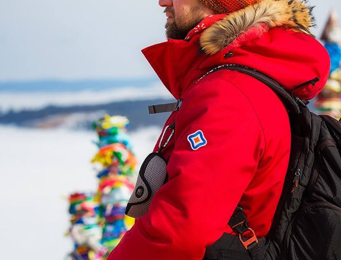
The logo and visual identity have been fully implemented.Merchandise has been developed and produced, including stickers, flags, patches, and vehicle applications.
Project Team.
Art Direction: Evgeny Golovach
Project Coordination: Elena Gordeeva
Production: Serg Kakhalsky


Other projects