
Motoragazzi
Traveling on mopeds in Italy
Brand identity and visual system for one of the largest digital scooter tour operators in Italy.
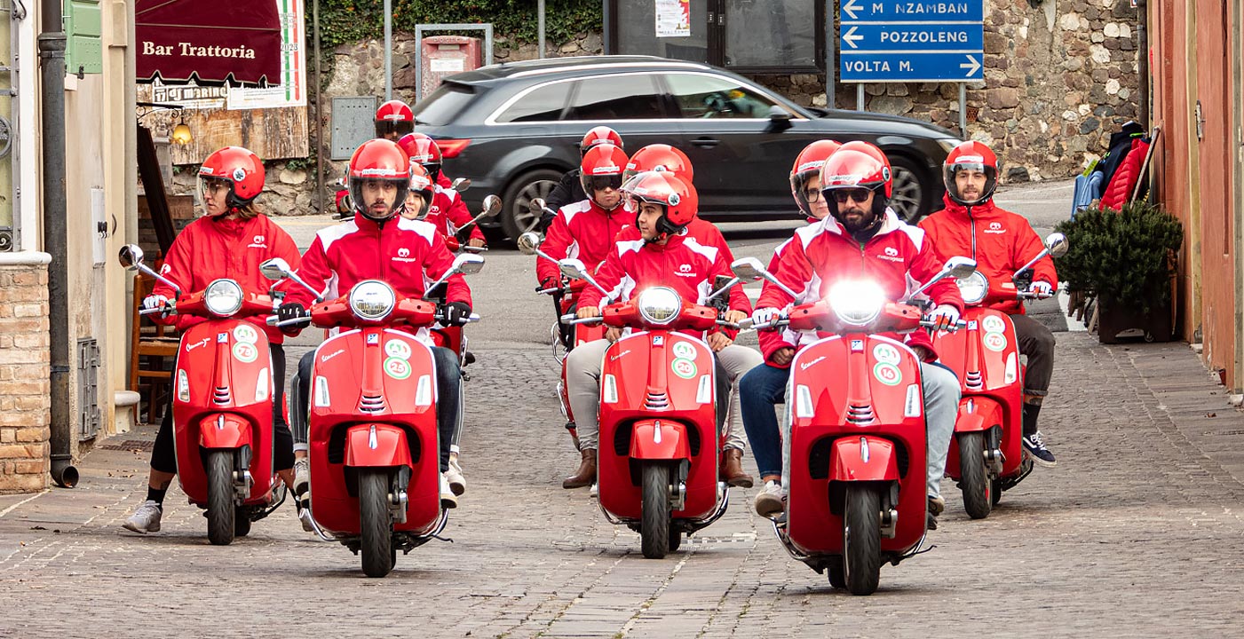
Motoragazzi is one of the largest digital tour operators in Italy, specializing in self-guided scooter travel.
Task
Develop a distinctive and memorable visual identity for a growing travel brand.
Create a logo and a scalable system that works consistently across multiple locations and touchpoints.
Solution
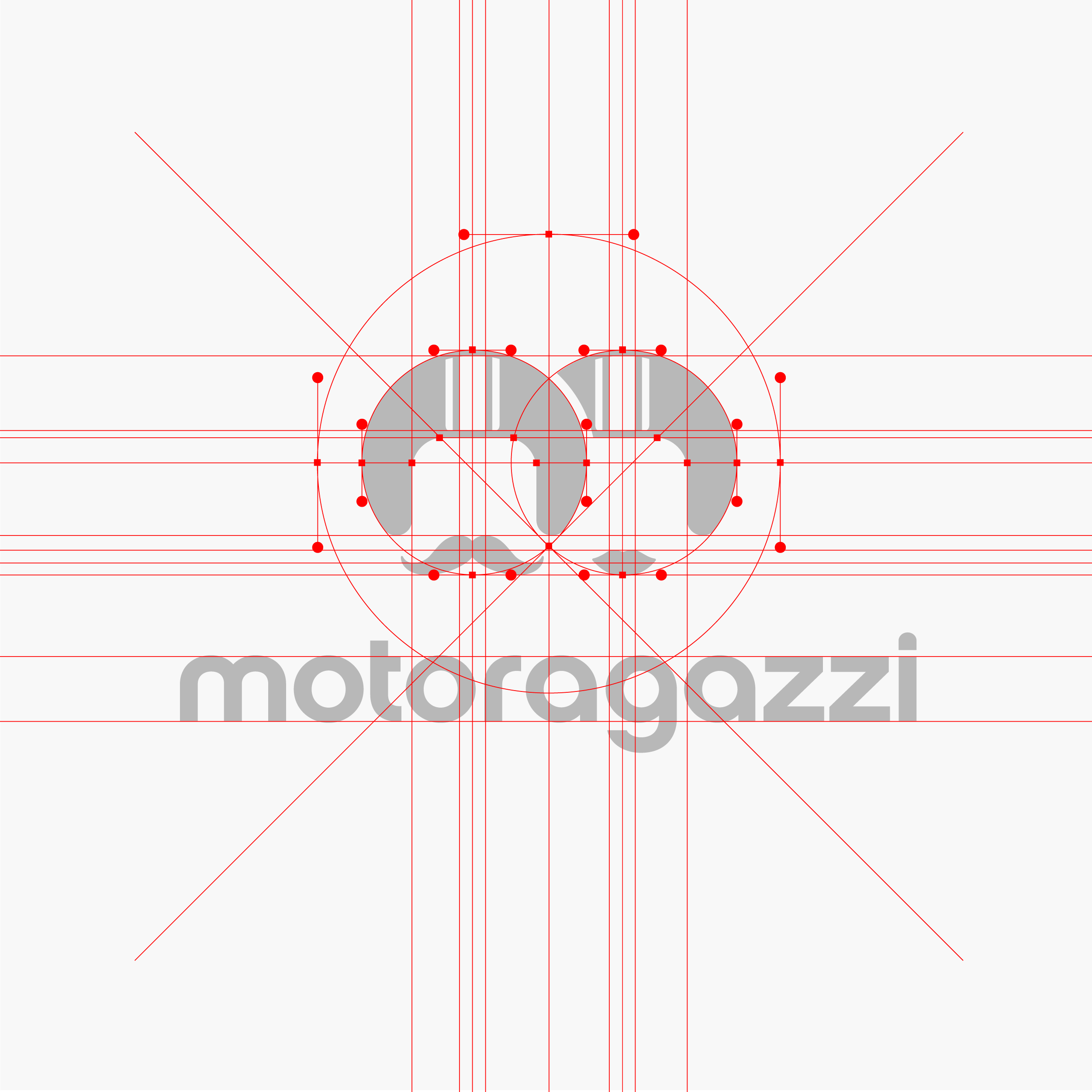
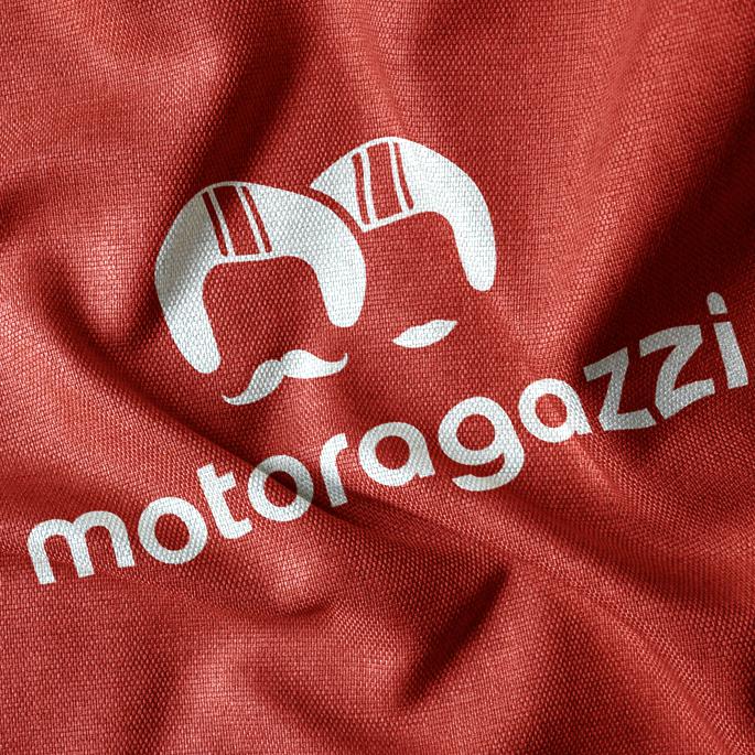
The identity is built around the letter M as a structural base.
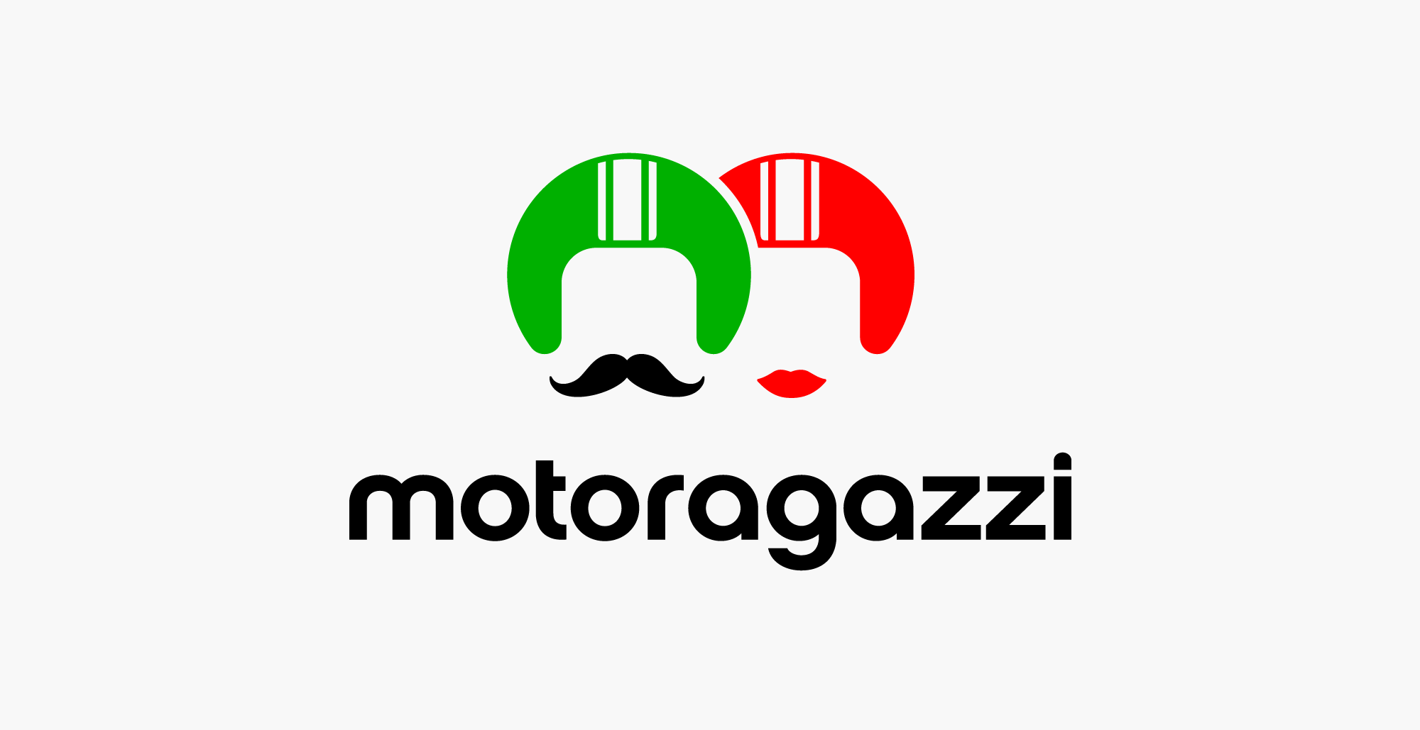
From this form, two helmet silhouettes emerge, representing a couple traveling together.
This creates a clear and instantly readable visual metaphor.
Italian national colors are embedded directly into the symbol to reinforce geographic context.
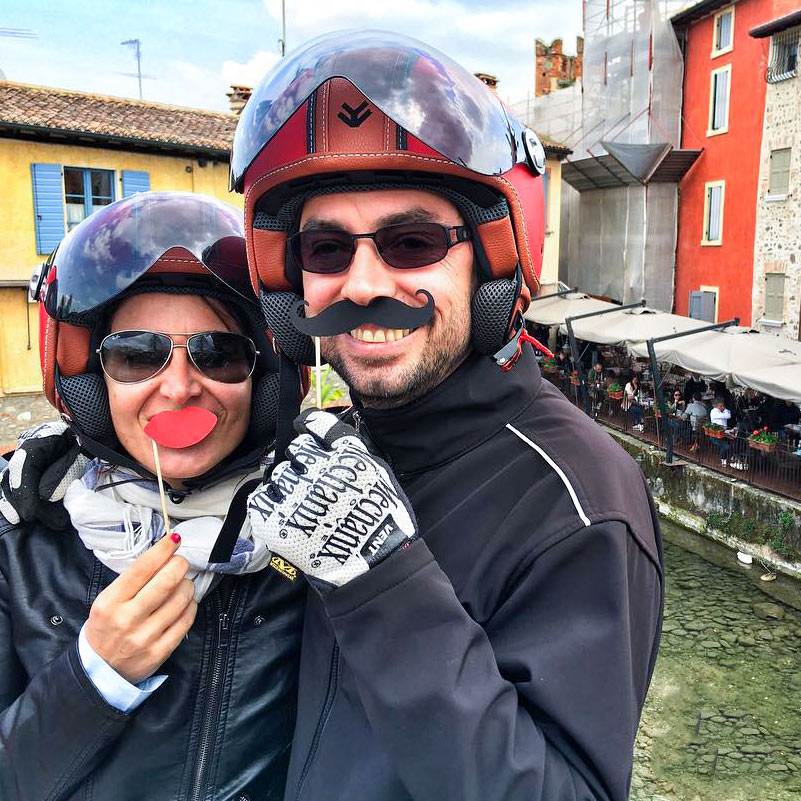
Additional elements such as a moustache and lips introduce character and emotional contrast.
The result is a bold, recognizable mark with strong associative clarity.
Implementation
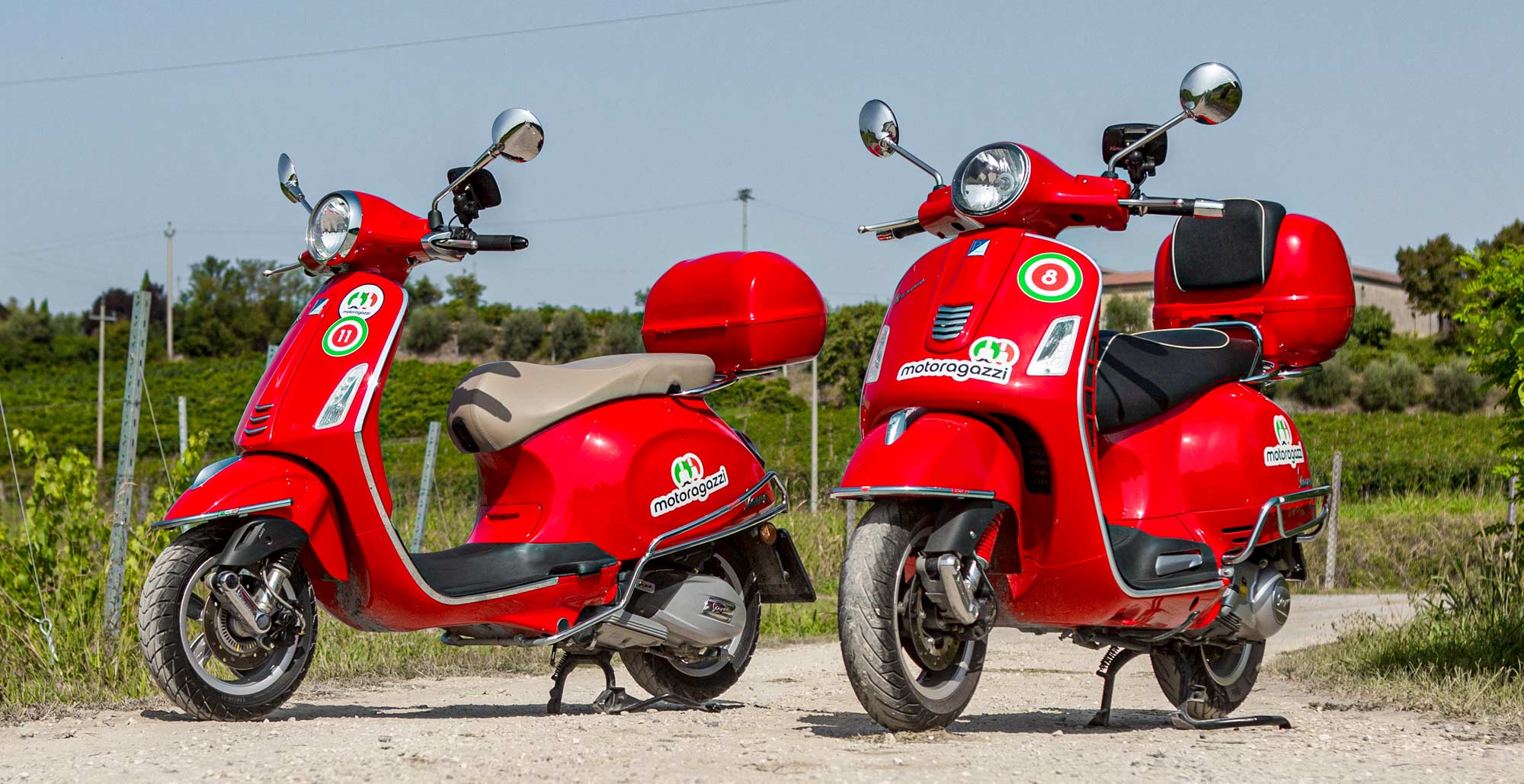
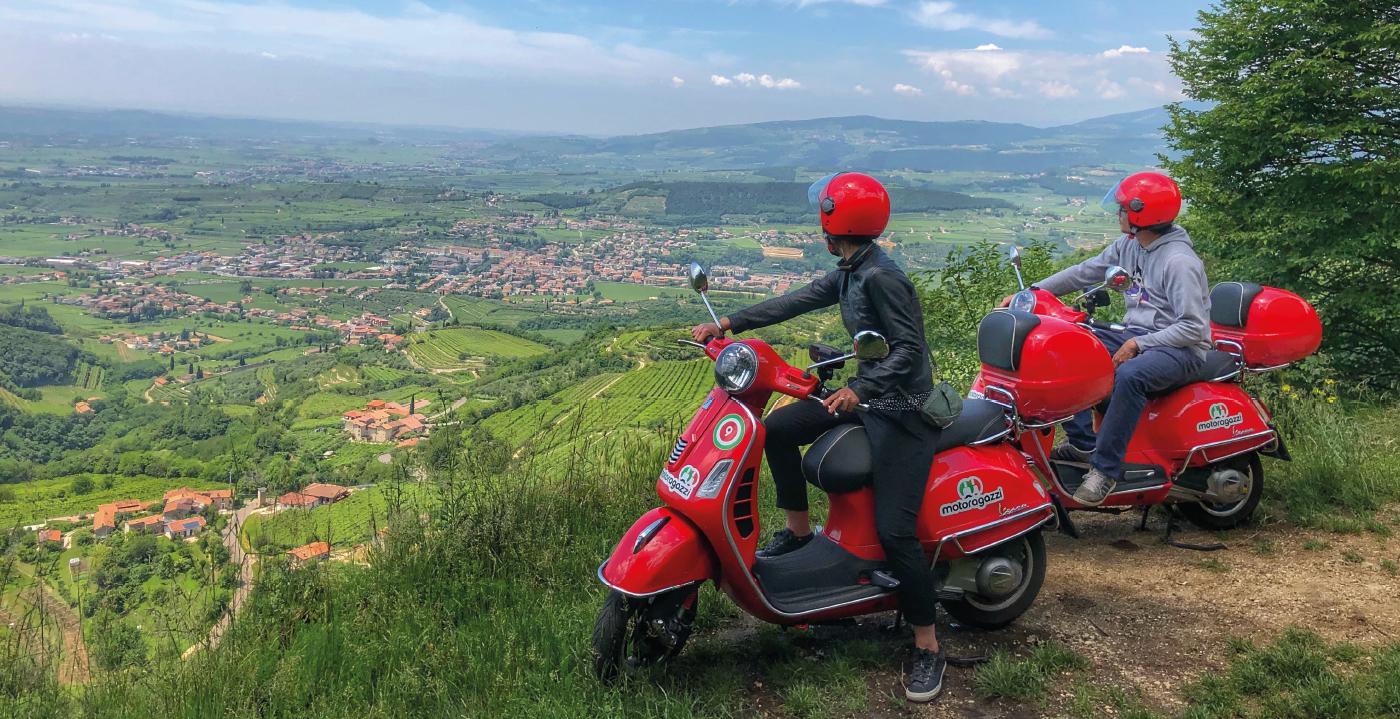
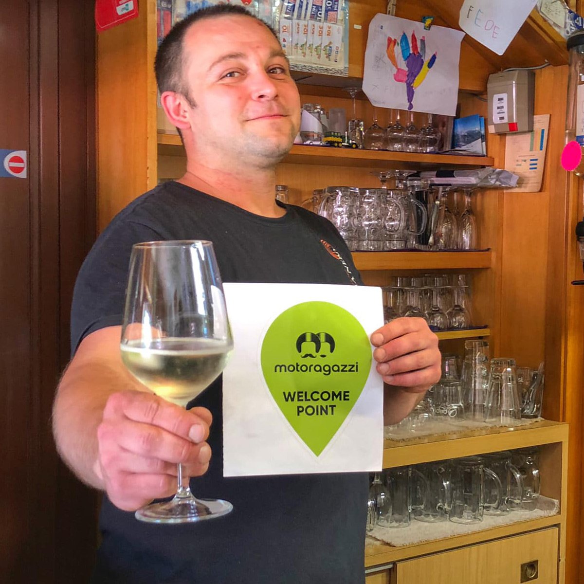
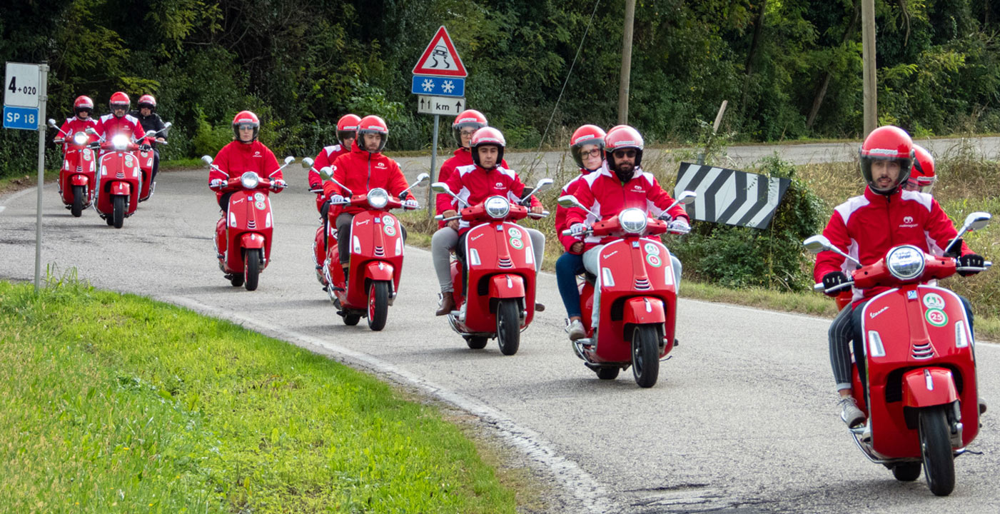
The identity system was implemented across 10 locations in Northern Italy.
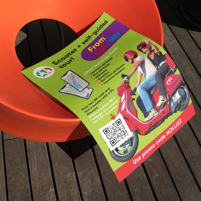
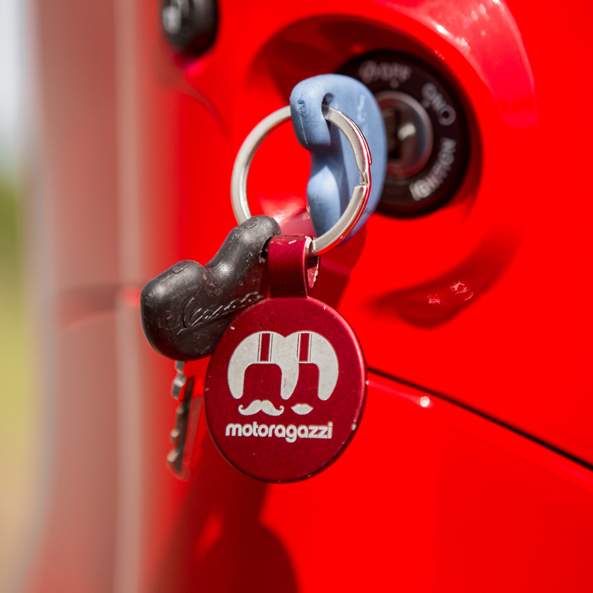
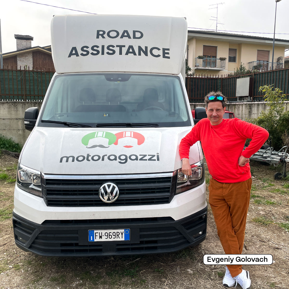
It works consistently in signage, printed materials, and digital environments.
The visual language remains stable, scalable, and easily recognizable across all media.
Other projects